Patterns of Place
Travelers author their own keepsake from Nepal's carved motifs.
Experience & Visual Designer
ROLE
Touchscreen, Web,
Phone via QR
PLATFORM
August 2025 - April 2026
TIMELINE
Figma
Adobe Illustrator
Vercel
VS Code
Claude
TOOLS
Travelers in Nepal leave with mass-produced souvenirs that hold no personal story.
Problem
TL;DR
What I built
A touchscreen kiosk where visitors turn carved motifs into their own postcard, sent to their phone by QR.
My Role
Solo user experience & visual designer. Research, motif system, interface, and vibecode.
Result
Shown live at Imagine RIT to 250+ visitors. 100+ created their own designs. A web version is live.
visited the exhibit
250+
IMAGINE RIT 2026
created their own designs
100+

Five hours. One touchscreen. No design experience required. Visitors walked up curious and left with a design they made themselves.
Try it live
The Problem
Why a generative kiosk
Nepal has some of the finest craftsmanship in the world. The souvenirs sold around it are mass-produced. Most travelers leave a site with a generic postcard or a stock photo that thousands of others already own.
That object has no link to their visit. It holds no personal story and no specific moment. The traveler stays a passive observer, buying a memory someone else made.
A kiosk sits at the site, where the visit happens. A generative system lets every visitor make something different from the same source material.
The QR handoff moves the result to the visitor's phone. The keepsake leaves with them, and they made it.
Three Pillars
The project moves a visit from heritage to keepsake in three parts.
Carvings become a modular design language.
The System
01
Visitors author a composition with that language.
The Interaction
02
Memory
03
The result leaves as a postcard and a digital copy.
The System
01
The system turns Nepalese wood carvings into a modular digital language. I photographed carvings at Patan and Kathmandu Durbar Squares, then extracted, simplified, and vectorized their motifs. Each became a reusable unit that arranges into linear or radial compositions.


Photograph
Vector
Final Motif
Linear Pattern
Radial Composition
Motif Library
Pattern Library
Single units, the base vocabulary.
Units combined, layered, and repeated.
Units can repeat in a line or around a center. They can also combine, so two traditional motifs become a pattern that did not exist in the source.

Individual Motifs
Linear Pattern
Radial Composition
The Interaction
02
The kiosk runs one step at a time. Structure first, then layers, then patterns, then refinement.
FOUNDATION
Structure comes before decoration
Visitors start by picking a base composition: Concentric, Diagonal, Trinity, or Corners. It sets the balance of the final piece. Every later choice sits inside it.


RING STUDIO
Compositions are built in layers
Visitors add, arrange, and refine rings and clusters. The layers build a dynamic hierarchy of forms and patterns.

PATTERN PICKER & PATTERN LAB
Visitors can pick a pattern or make their own
Pattern Picker offers every pattern in the library. Pattern Lab lets visitors mix them. Take two different motifs, then align, transform, and scale them into something new.
REFINEMENT
Every touch gesture has a slider
Scale, density, placement, and color update in real time. Visitors can rotate and scale by touch or with a slider. Motif palettes and background colors finish the piece.


Memory
03
The finished piece exports as a high-resolution postcard with a QR-linked digital copy. Visitors scan the code, email it to themselves or save it to their photos. The kiosk keeps nothing. The keepsake goes home with them.


Scan QR code on phone
Download your postcard
View your postcard anytime
The identity had to feel rooted in heritage and still read as contemporary. It carries across the kiosk, the phone, and print.

VIsual Identity
Elegant serif typography that reflects timelessness, craftmanship, and cultural richness.
TYPOGRAPHY


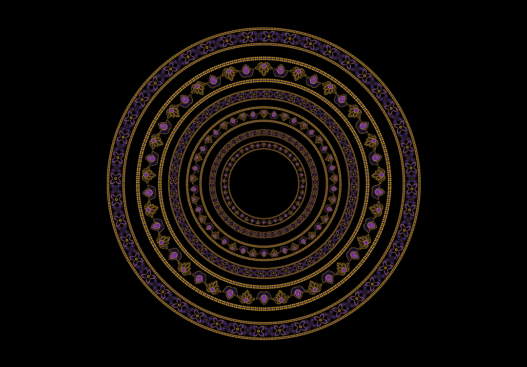
Warm gold accents and deep violet on dark backgrounds. The pairing balances heritage ornament with a contemporary visual aesthetic.
COLOR PALETTE
Five motifs taken from the architecture, ranging from strict geometry to the lotus. Rendered in gold and violet, they read as one family.
MOTIFS
Radial arrangements give every output the same balance, on screen and on paper.
COMPOSITION LANGUAGE
Thesis critique and real hardware both changed the design.
Design Evolution
Simpler Interface
Critique pushed for fewer visible options. I cut controls back across iterations so each step shows only what it needs.
Touch + sliders
Visitors can scale and rotate by touch. Each gesture also got a slider, added after critique.
Hardware limits
The planned kiosk was unavailable, so it ran on a touchscreen TV. The TV did not support three-finger gestures. I removed them and kept two-finger gestures.
Built in code
A generative system has to run before you can judge it. I built it in VS Code with AI-assisted coding. Developers helped me fix a few technical issues.
The kiosk ran live at Imagine RIT, a public festival. I offered brief guidance while at the station. During an unattended hour, visitors explored the kiosk without guidance.
People experimented freely. Kids were the most engaged, which I did not expect. Some visitors loved how trippy it felt. I had never seen it that way. Diagonal and Concentric were the most picked base compositions.
At IMAGINE RIT
live, from 10 am to 3 pm
5 hrs
visited the exhibit
250+
created their own designs
100+
for about 100 printed promo postcards & stickers to run out
< 2 hrs


Generated Outcomes
Different choices, one visual language.
The full experience runs in the browser. Build a composition and export your own postcard at pattern-next.vercel.app or click the "Begin" button below.
At IMAGINE RIT


The visual language extends beyond the kiosk experience, creating a cohesive ecosystem of physical and digital touchpoints that reinforce the connection between heritage, creation, and memory.
Touchpoints


Reflection
Building it changed how I design. Prototyping in code with AI-assisted coding let me test the generative system as it actually behaved, not as a mockup suggested. It also showed me where design ends and engineering begins. For the hardest technical problems, I brought in developers.
Constraints are design inputs. The venue hardware could not support three-finger gestures, so the interaction model had to adapt.
Audiences bring their own reading. Kids became the most engaged group, and some visitors saw the work as psychedelic. I planned for neither, and both widened who I think the project is for.
What I learned
Reduce the interface further. Use progressive disclosure so each step shows only what a first-time user needs.
Deepen the cultural layer. Bring more of Nepal’s visual language into the experience.
Test where it belongs. Put it in front of travelers in Nepal, at the sites the motifs came from. That step depends on funding for fieldwork.
What I'd do next